Alaska Airlines Through the Years: A Livery Love Story
Airline liveries have gotten complicated with all the brand consultants and market research flying around. Today, I will share it all with you.
Alaska Airlines has been around since 1932, which means I get to nerd out about almost a century of design evolution. And honestly, the changes tell the story of the airline itself better than any press release ever could.
The Early Days (Pretty Boring, Honestly)

In the 1940s, Alaska Airlines planes looked like… well, planes. Basic lettering, the company name, that’s about it. Nothing special. But that was normal back then – airlines were still figuring out that branding even mattered. Most carriers were too busy just trying to stay in business to worry about aesthetics. Function over form, as they say.
The Gold Rush Branding (1950s)
This is when things got interesting. The 1950s brought the gold nugget symbol – they literally leaned into Alaska’s gold rush history. The phrase “Golden Nugget Route” became their thing, connecting the airline to this idea of adventure and opportunity. I’ve seen vintage ads from this era, and they really sold the romance of it.
Pretty clever marketing, if you think about it. Alaska evokes wilderness, gold miners, frontier spirit. They embraced that instead of trying to seem like some generic carrier.
Jet Age Glow-Up (1960s-1970s)

When Alaska got the Convair 880 in the ’60s, they updated their look to match. Sleeker lines, more dynamic designs, colors that popped. Eagles started appearing on the tails – a nod to both American identity and Alaska’s wildlife. Smart move tying it to something visual and powerful.
This was when airlines started really competing on image, not just routes and prices. It wasn’t enough to just fly safely; you had to look good doing it. Alaska figured this out earlier than some of the bigger legacy carriers.
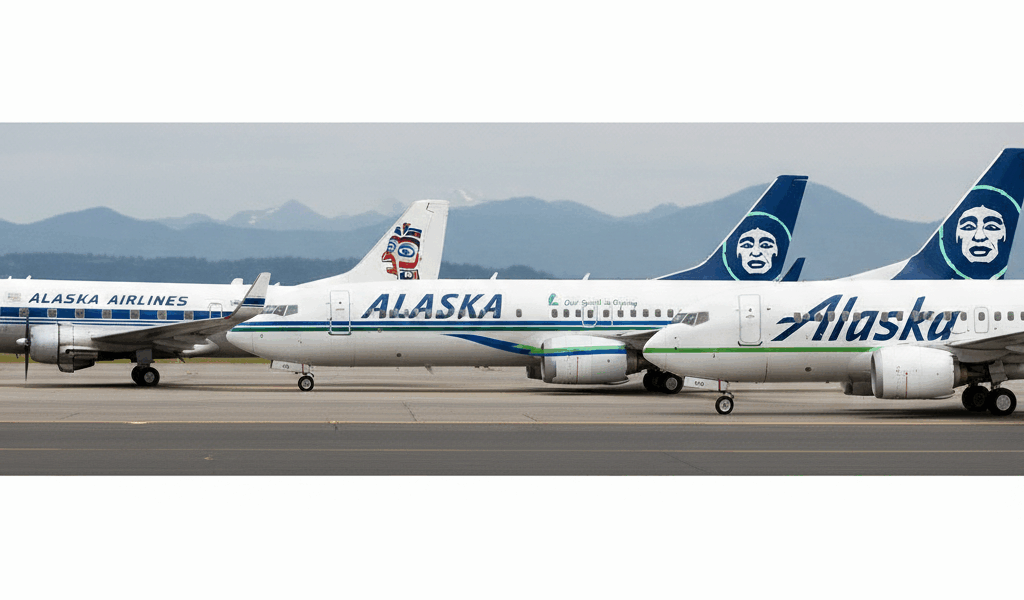
The Famous Eskimo Face (1970s-1980s)
Okay, this is the one everyone knows. That face on the tail? It’s become so iconic that I can spot an Alaska plane from miles away just from the tail design. And trust me, I’ve tested this theory at many airports.
The image is actually a composite of several indigenous Alaskan personalities – it’s meant to honor the region’s native heritage. Whether that lands correctly in 2024 is a fair debate, but the intention was to tie the airline’s identity to the people and culture of its namesake state. I appreciate the thought, even if execution is always tricky with cultural representation.
It’s been refined over the years, but the basic concept has stuck around for nearly 50 years. That’s remarkable for any brand in any industry. Most companies rebrand every decade just to feel relevant.
Special Liveries Era (1990s-2000s)
This is when Alaska started having fun with it. As they expanded routes and added planes, they started doing special paint jobs celebrating different things – state flowers, regional imagery, partnerships, you name it.
The Disney planes were my absolute favorite. They painted aircraft to promote Disneyland routes, with actual Disney characters on the fuselage. Kids losing their minds over seeing a Mickey Mouse plane? Yeah, that’s good marketing. I saw one at SEA-TAC once and the gate area was chaos in the best way.
They’ve done sports teams, conservation themes, special events. Each one is kind of collectible – plane spotters get excited when a special livery shows up. There are whole forums dedicated to tracking where these birds are flying on any given day.
The 2016 Rebrand
Major update in 2016. Vibrant blues and greens inspired by northern lights and Alaskan landscapes. Sleeker font, more modern overall vibe. Everything felt refreshed without feeling alien.
But here’s what I respect: they kept the Eskimo face. They could have ditched it for something more “contemporary” but they didn’t. That says something about valuing heritage over trendiness. Not every brand decision needs to chase whatever design trend is hot that year.
The new look aligned with tech upgrades like inflight Wi-Fi and expanded routes. The whole brand felt unified in a way it hadn’t before. Paint scheme, interior design, digital presence – all singing from the same sheet music.
Where They’re Headed Now
Recently, Alaska has been incorporating sustainability messaging into some of their liveries. They’re highlighting environmental initiatives, sustainable fuel efforts, community engagement. Green credentials painted right on the fuselage.
Is it partly marketing? Sure. But the aviation industry does need to address its environmental impact, and at least they’re putting their planes where their mouth is (so to speak). Actions matter more than slogans.
Quick Timeline
- 1932: Alaska Airlines founded
- 1940s: Basic, functional livery
- 1950s: Gold nugget branding introduced
- 1960s: Modernized look with Convair 880
- 1970s-1980s: Eskimo tail fin debuts
- 1990s: Heritage celebrated through special liveries
- 2000s: Disney and partner collaborations
- 2016: Comprehensive brand refresh
- Present: Sustainability focus
There’s something satisfying about watching a brand evolve over nearly a century while still staying recognizable. Alaska Airlines got that balance right. You see that tail, you know exactly whose plane it is. No confusion, no second-guessing. That’s branding done properly.


Stay in the loop
Get the latest airport guides world updates delivered to your inbox.